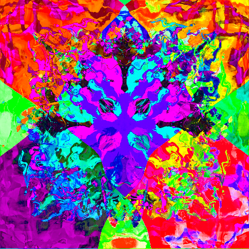
This piece is a digital abstract painting composed of intense and distinctive colors. The colors are arranged in a random, but harmonious, order. The painting is set to completely cover any background, which allows the colors to “pop“ and stand out. The painting is meant to be visually pleasing and to evoke a feeling of happiness and joy, but also intensity and even fear.
The artist has used a variety of colors to create a visually stunning piece of art. The colors are applied in a way that makes them appear to be splashing or striking across the canvas. This creates a dynamic and energetic feel to the piece, which may even invigorate the casual viewer.
The center structure is a focal point, and it provides a sense of stability amidst the chaos of the colors and textures. These waves of color are bright and vibrant, and radiate out from the center in a chaotic, plasmatic pattern.
Being very real with you for a moment, one of the early iterations – COMPLETELY BY CHANCE – featured the center structure looking like a burning, energetic swastika. This was not good. My design decisions went from “explore the space” to “GET RID OF THE SWASTIKA” real fast.
I now think that it’s a tiny lil rite of passage for an abstract artist to accidentally generate something super offensive by accident during the process.
I will say that I love how this one turned out, the colors, the flaming radiance, the wavy patterns around the edges. This one is spectacular and could’ve easily been a full size work. In fact it’s one of the few tests that I’m sad I didn’t happen on in full resolution. Still, I love this piece.