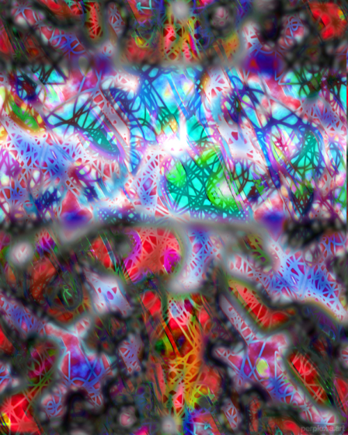
This piece is a digital abstract work which explores the idea of religious conflict and the violence that can come with it. The colors are sharp and bright, representing the blood that is shed in these wars. The shapes are chaotic and jarring, representing the chaos and destruction that these wars bring.
This piece is meant to convey that despite the beliefs and convictions held by the instigators of these awful conflicts, that faith is not worth the fight. At the center of the piece is a brighter band of blue, meant to convey the idea of divinity behind it all, and yet if the divine is what’s making us go to war, then how divine can it really be?
There is the vague hint of a cross-like shape behind it all, which may be symbolic for something or other, who can tell? Here’s the full-resolution detail:
Although I strongly agree and identify with the message I put behind this piece, it was just too on the nose for me. Like, it’s so blatant, y’know? It smacks me in the face and wrings me out to dry and there’s only one interpretation left for my shriveled out self. Maybe it’s not the same for you, but you’re not the one determining which pieces go where in my sets, are you?
Also, tbh, I hated the thickness of the brushstrokes I was using here. It looks so cartoony and yarny. In an interesting artistic coincidence, the obviousness of the lines match the obviousness of the message. Which makes this piece thematically consistent in the ways that I dislike it. Huh! I do love the colors, and I love some of the feelings I get from this, but in the end it just wasn’t good enough to make the cut.